


Modern offices are busy, fast-moving environments. Open-plan layouts, shared facilities, and multi-floor buildings can easily cause confusion without clear guidance. Directional signs play a vital role in helping people move confidently through these spaces.
Footprint Signs & Graphics support businesses by designing, manufacturing, and installing professional directional signage solutions in Cambridge and beyond, helping offices function smoothly from day one.
What Is Office Wayfinding and Why It Matters
Office wayfinding is the system of signs, symbols, and visual cues that guide people through a workplace. It helps staff and visitors understand where they are and where they need to go. Without it, even the most impressive office can feel frustrating and unwelcoming.
Reducing Confusion in Busy Workspaces
Large offices often have multiple departments, meeting rooms, and shared areas. Directional signage removes guesswork. Clear directions mean fewer interruptions, fewer late meetings, and less stress for everyone.
Creating a Calm and Professional First Impression
Visitors form opinions quickly. Well-planned directional signs show that an organisation is organised, thoughtful, and professional. A smooth arrival experience sets the tone for meetings and business relationships.
How Directional Signs Support Employee Productivity
Time wasted looking for rooms or facilities adds up. Directional signs help employees move efficiently between tasks. When staff can navigate their workspace with ease, they stay focused and productive throughout the day.
Improving Visitor Experience Through Clear Navigation
Clients, delivery drivers, and new starters rely on signage to find their way. Directional signs for offices reduce anxiety and make visitors feel welcome. Clear navigation also minimises the need for staff to leave their desks to give directions.
Key Principles of Effective Office Directional Signage
Successful wayfinding systems follow a few simple but important rules. These principles ensure signs are easy to read, understand, and trust.
Visibility and Contrast
High-contrast colours improve readability. Dark text on light backgrounds works best in most environments. Signs should stand out without clashing with the space.
Simplicity and Consistency
Short messages work best. Simple language, clear fonts, and consistent colours help people recognise signage quickly. Sans-serif fonts are easier to read at a glance.
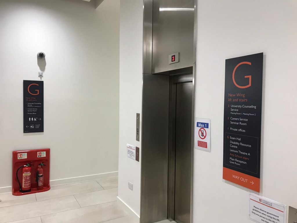
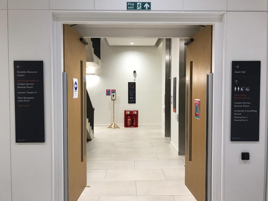
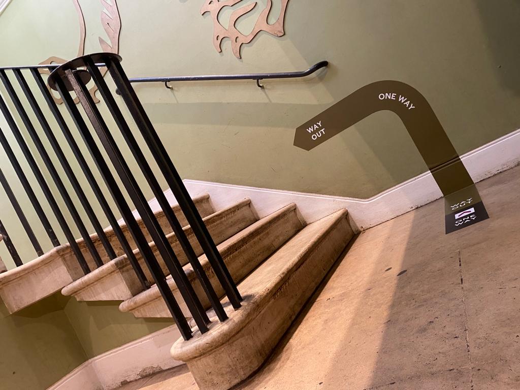
Strategic Placement at Decision Points
Signs should appear where choices are made. Corridors, junctions, lifts, stairwells, and entrances are key locations. Well-placed signs prevent wrong turns before they happen.
Icons, Arrows, and Universal Symbols
Symbols are processed faster than words. Using familiar icons alongside arrows makes directions clear, even for visitors who speak different languages.
Accessibility and Inclusive Design
Directional signage should be accessible to everyone. Signs placed at eye level, along with lower options for wheelchair users, improve usability. Braille and tactile lettering support visually impaired users and promote inclusive design.
Types of Directional Signs for Offices
Different spaces require different signage solutions. A mix of sign types creates a complete and effective wayfinding system.
Directory and “You Are Here” Signage
Directories give an overview of the building layout. Positioned at entrances or lift lobbies, they help users plan their route before moving through the space.
Junction and Pathway Signs
These signs guide people at intersections and along corridors. Ceiling-mounted, wall-mounted, or floor-mounted options ensure directions remain visible in busy areas.
Room Identification Signage
Clear room labels outside offices, meeting rooms, and restrooms reduce hesitation. Interchangeable nameplates are ideal for flexible workspaces that change often.
Colour-Coded Zoning for Clear Office Navigation
Colour coding helps people navigate instinctively. Different colours can represent departments or functions. This approach works well alongside physical signs, walls, and floor graphics for quick visual recognition.
Read More: What Colour Do Health and Safety Signs Need to Be?
Best Practices for Office Wayfinding Design
Thoughtful design ensures signage remains helpful rather than distracting.
Reducing Visual Clutter
Too much information can overwhelm users. Directional signs should show only what is needed at that moment, keeping the environment calm and clear.
Integrating Branding into Signage
Directional signage can reflect company identity. Using brand colours, logos, and fonts creates a cohesive look that strengthens brand recognition throughout the office.
Choosing Durable, Long-Lasting Materials
Materials like acrylic, brushed metal, and glass withstand high-traffic areas. Durable signage maintains its appearance and legibility over time.
Maintaining and Updating Office Directional Signage
Offices evolve. Departments move, layouts change, and teams grow. Regular signage audits every six to twelve months ensure directions remain accurate and relevant.
Health, Safety, and Compliance in Office Wayfinding
Directional signage supports health and safety compliance. Clear routes to exits, stairwells, and emergency facilities help protect staff and visitors. Well-marked spaces reduce risk and improve overall workplace safety.
Creating Smarter Workspaces with Professional Directional Signage
Directional signs are a foundation of efficient, modern offices. They improve productivity, enhance visitor experience, and support safety and accessibility. Footprint Signs & Graphics design, manufacture, and install high-quality directional signage solutions across Cambridge, Kettering, Enfield, Norwich and beyond, helping businesses create workspaces that are clear, professional, and easy to navigate.
Get your free signage quote today!